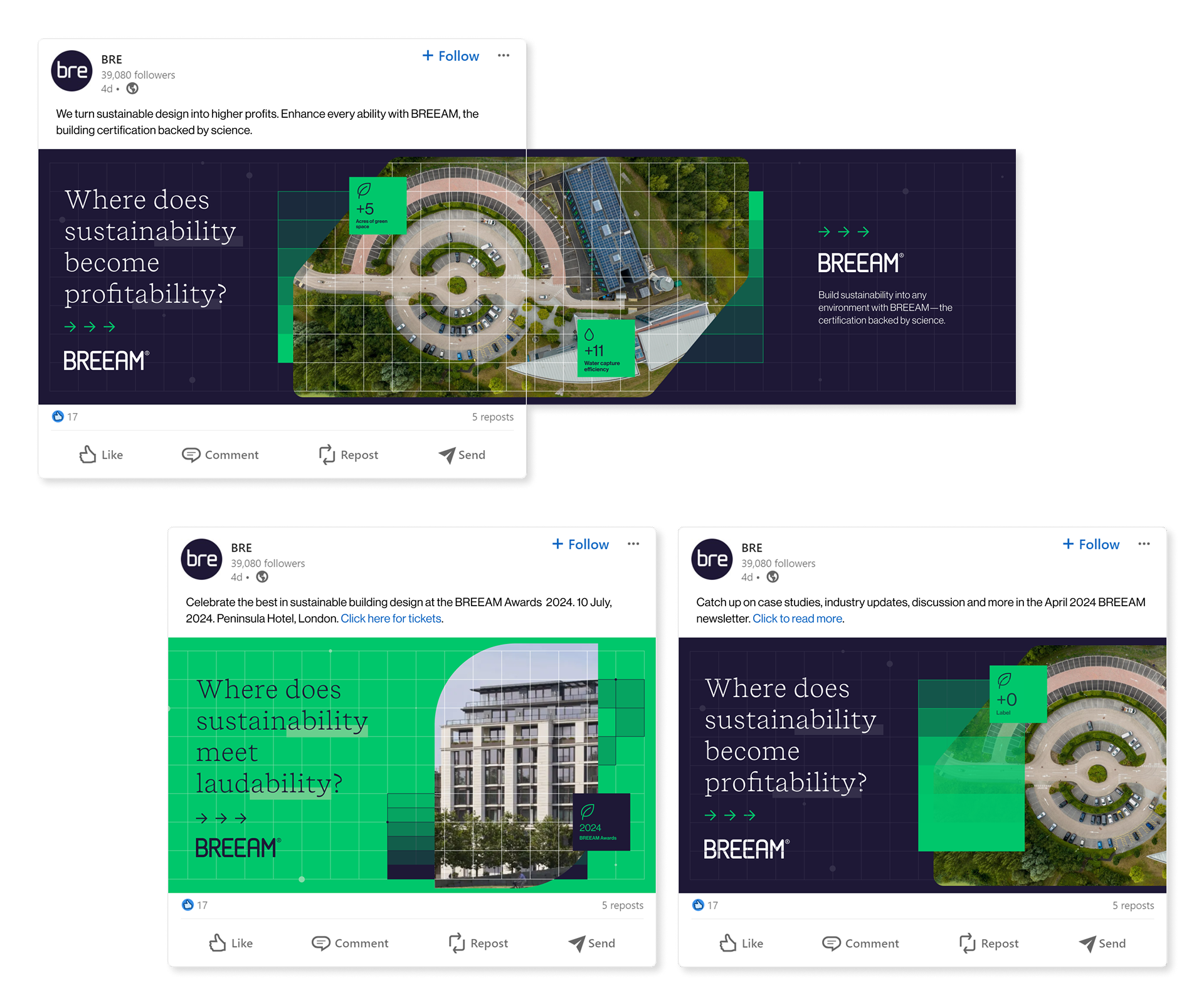
BREEAM Brand Refresh
Design / Art Direction / Campaign
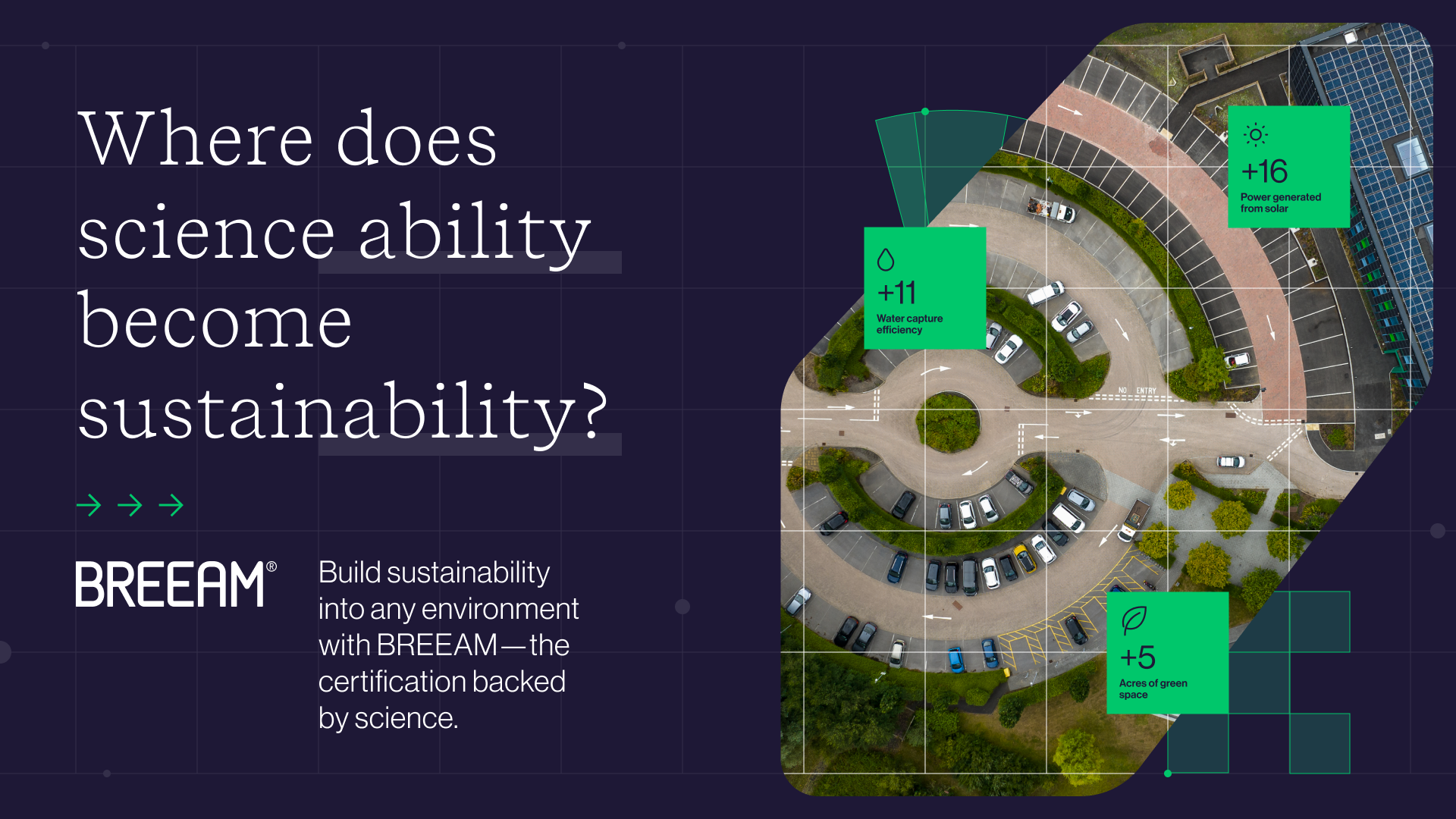
Refreshing sustainability’s gold standard for a modern market
I led concept development and art direction for a global brand refresh and campaign for BREEAM, a leading sustainability certification system.
Through research and strategic positioning, I helped clarify BREEAM’s role in a rapidly expanding sustainability market. The resulting brand system extended across digital experiences, social content, and large-scale out-of-home campaigns.
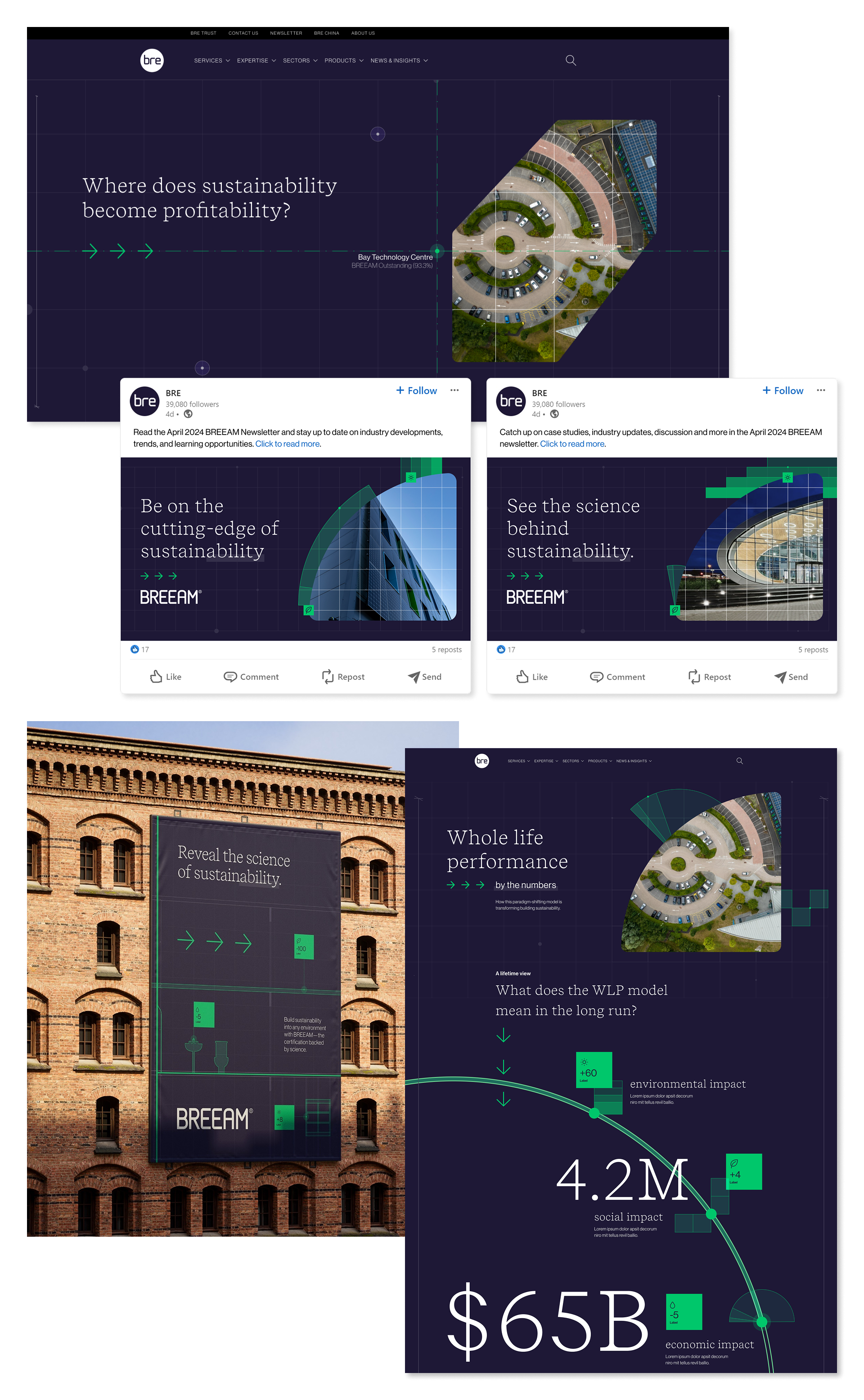
Campaign System